UX/UI Design · Uni Assignment · 2025
Turning a real access problem into a working app: research, persona, prototype, test.
Overview
After travelling, finding the same food and drinks back home wasn't always straightforward. Products could be scattered across supermarkets, specialty grocers and online stores, making availability, price and distance difficult to compare.
I wanted to find out whether this was a broader problem — and what actually mattered to people when searching for imported products.
Conveniently translate and find food and drinks from overseas while preserving their value?
Research
I started broad, mapping out who this affects and why, using the Five W's, then a Five Why's exploration to reach the root of the problem.
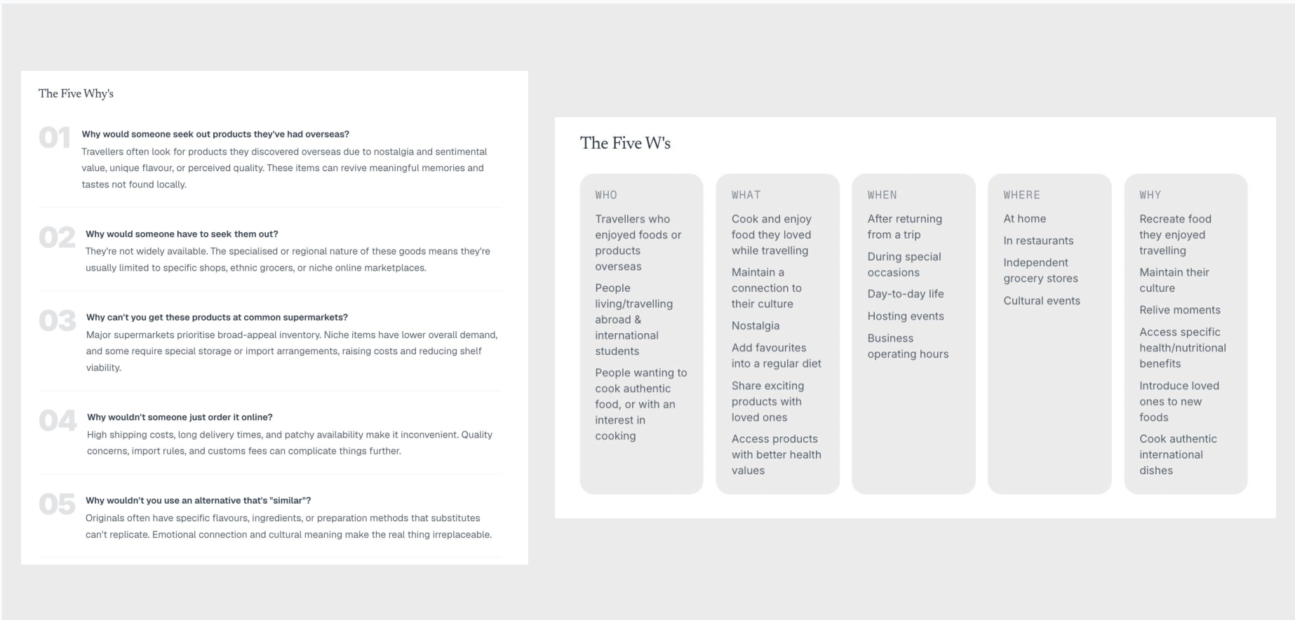
01 — Availability is fragmented
Imported products aren't necessarily unavailable — they're often spread across supermarkets, specialty grocers and niche retailers, making them difficult to locate.
02 — Online isn't always convenient
Ordering online expands the range, but shipping costs, delivery time and inconsistent availability can make it a poor substitute for finding something locally.
03 — The exact product matters
For some users, substitutes don't recreate the flavour, familiarity or cultural connection of the product they're actually looking for.
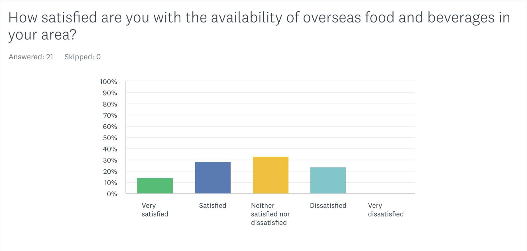
Three findings shaped the direction.
Most participants had travelled and tried overseas products. At least one hadn't, but was still interested.
Limited availability (62%) and high prices (67%) were the top barriers. People will travel short distances, but not long ones.
Flavour is the #1 factor. Willingness to pay more varies: younger shoppers stressed by rent, older by groceries.
Research
Convenient, but limited. Easy to access and familiar, but imported ranges are inconsistent and users may need to visit multiple stores.
More choice, more friction. Broader product ranges, but shipping costs and delivery times make them less useful when someone wants something locally.
Local knowledge, scattered information. People can recommend hard-to-find products, but information can be outdated, incomplete or spread across different platforms.
The opportunity: bring product availability, price and location together so users can compare their options in one place.
“I know what I want. Help me find the best place to get it.”
Easy to access and familiar, but imported ranges are inconsistent and users may need to visit multiple stores.
Where is this product available?
How do the options differ in price and distance?
Which store makes the most sense?
Ideate
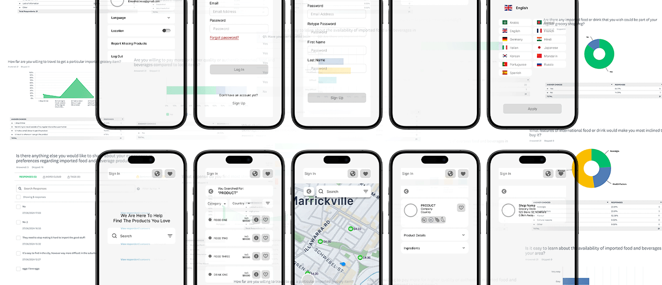
The research pointed toward a location-first experience. Rather than making users search individual retailers, the product could show where an item was available, what it cost and how far away it was — all from one search.
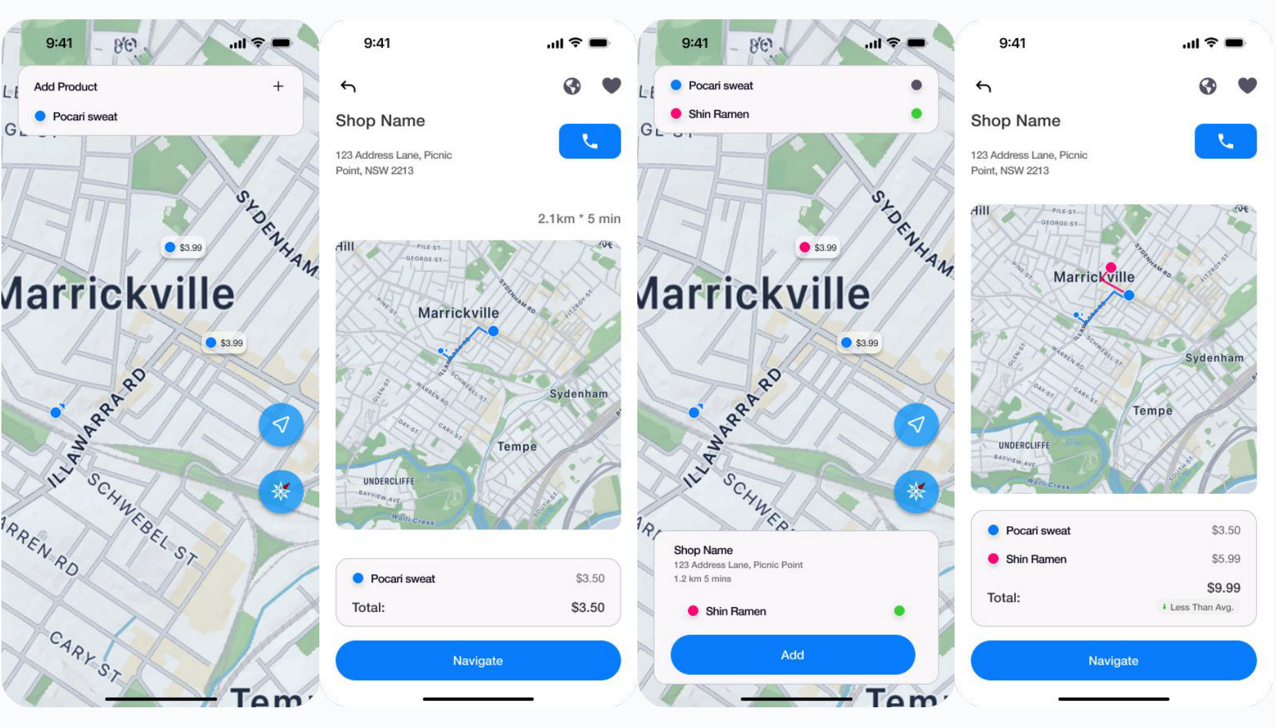
Test
Rather than looking only at whether they completed each task, I watched where their behaviour differed from how I expected the product to be used.
I tested for:
Change the app's language.
Create an account and complete sign-up.
Find Pocari Sweat and decide where to buy it.
5 Participants · Moderated Test · 3 Tasks · Interactive Prototype
Real-time inventory would be ideal but keeping stock quantities accurate creates a burden for businesses, therefore direct confirmation provides a practical fallback.
I introduced a shopping list that lets users save products as they browse. Instead of treating each search independently, the list gives the app a complete picture of what the user is trying to buy.
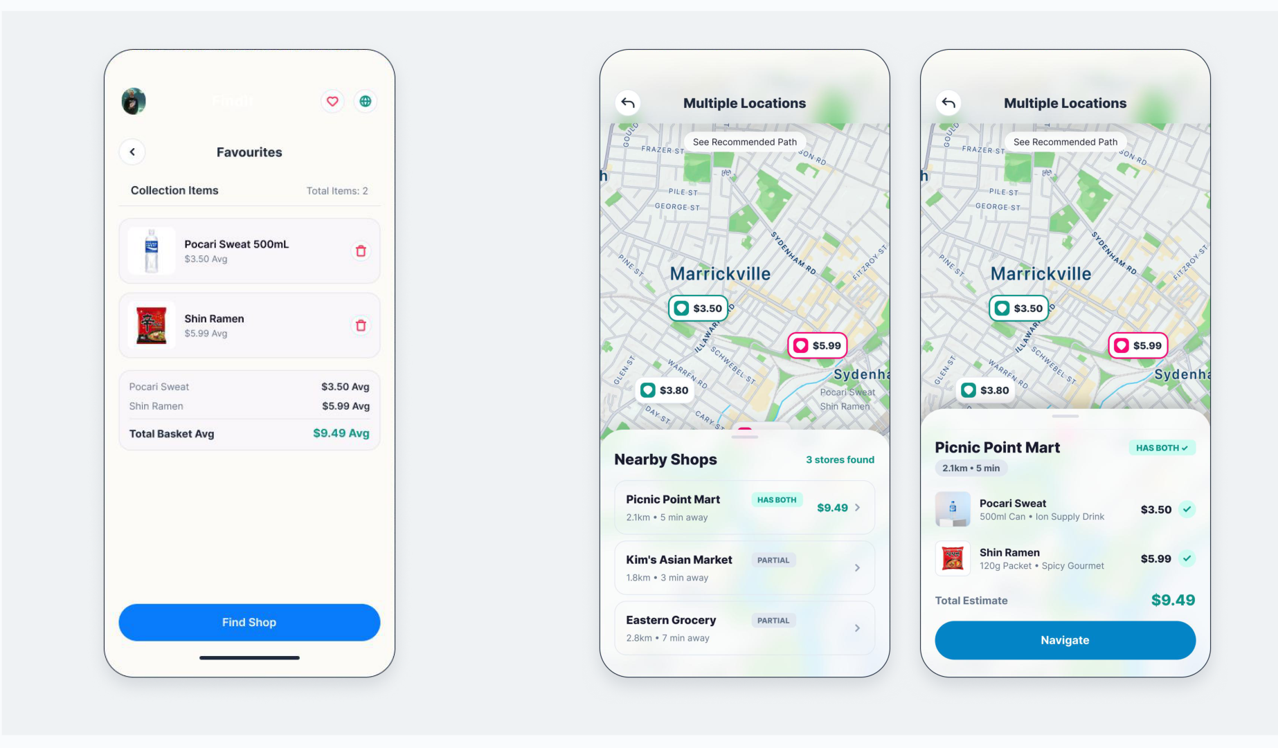
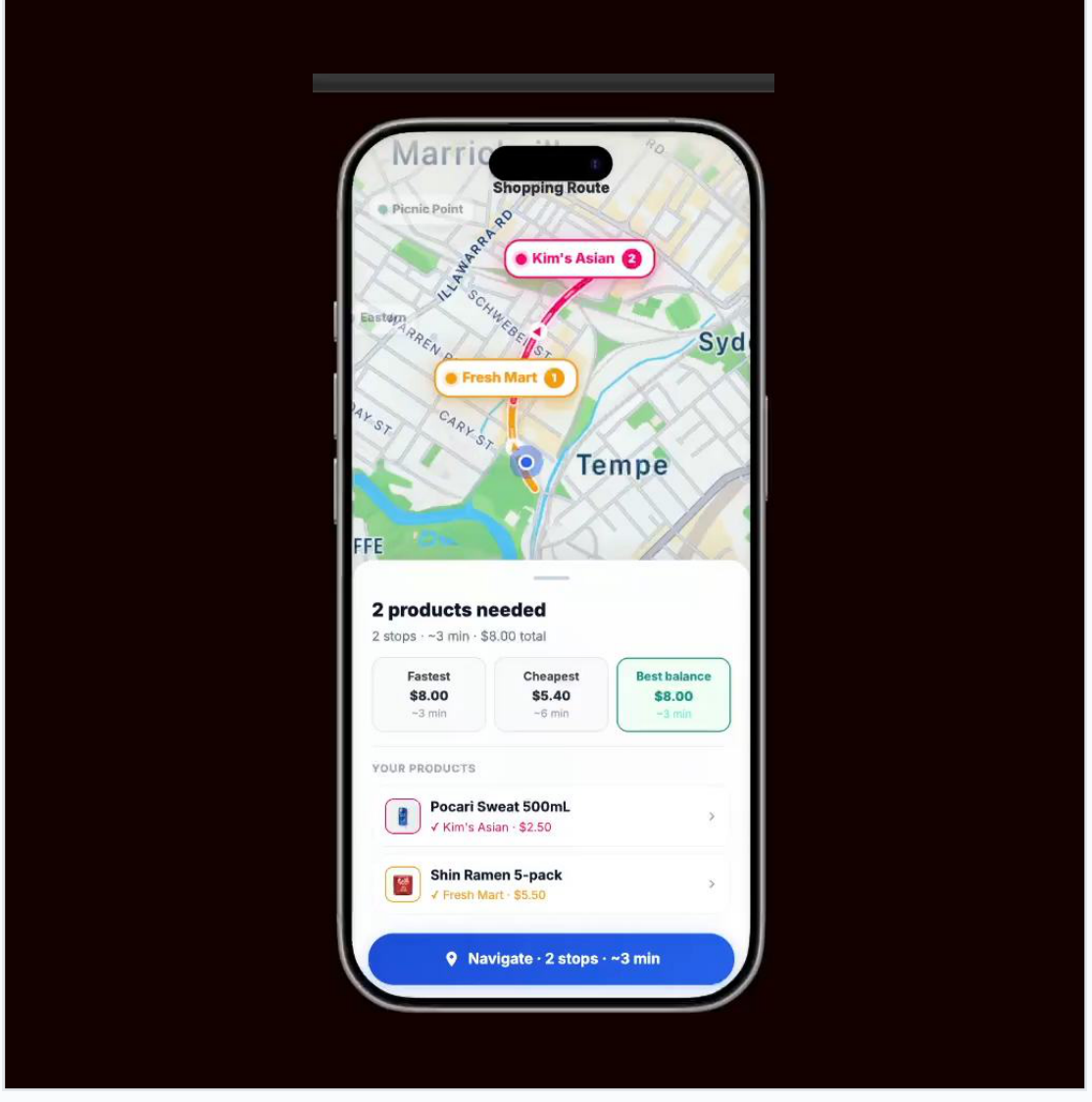
With multiple products selected, the question changes from “Who sells this?” to “Which option makes the most sense for my whole shop?”
The experience can compare nearby stores against the user's list, helping them weigh product coverage alongside price and distance.
Reflection
This project taught me that usability testing is most valuable when it challenges assumptions rather than simply confirming them. I entered testing expecting users to navigate the map in a particular way, but observing different behaviours pushed me toward more familiar interaction patterns and clearer decision-making. It also showed me the importance of connecting research findings directly to product decisions, rather than treating research, ideation and testing as separate stages.
The concept was tested as an interactive prototype rather than a live product, so the next step would be validating the revised map experience with a new round of users and testing how reliable store availability information could work in practice.
More Work