UX/UI Design · Freelance · 2026
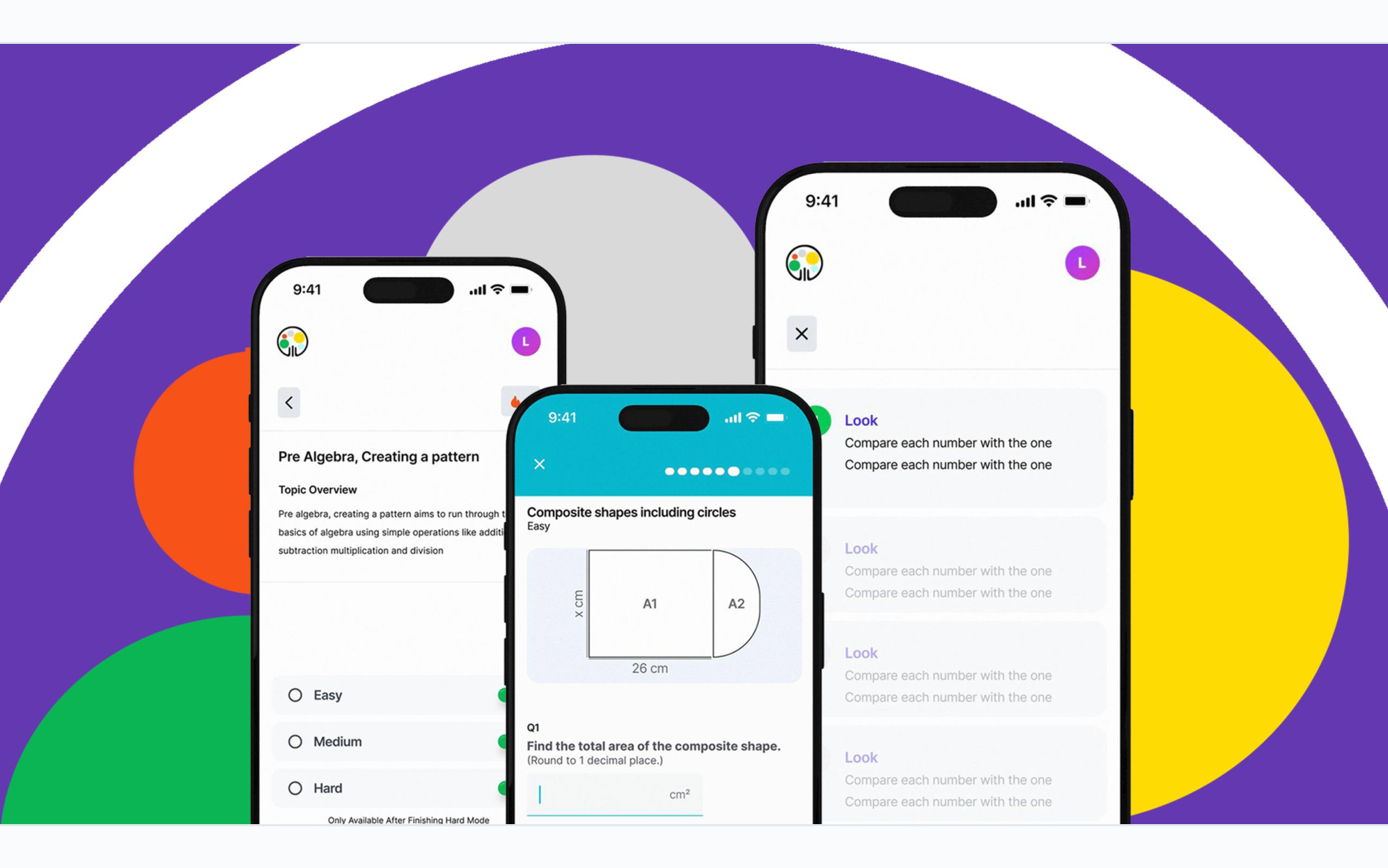
I inherited a product that had been developed for two years, discovered fundamental barriers to actually deploying it, and helped turn it into something that reached a real classroom.
Overview
I inherited a product that had been developed for two years, discovered fundamental barriers to actually deploying it, and helped turn it into something that reached a real classroom.
Development had already been underway for two years when I joined the project. I started by working within what had already been built — simplifying key user flows, reducing unnecessary clicks, improving navigation and making small UI changes to create a clearer experience.
Problem
A UX case study on integrating a calculator into the quiz flow — keeping students in context without simplifying the challenge.
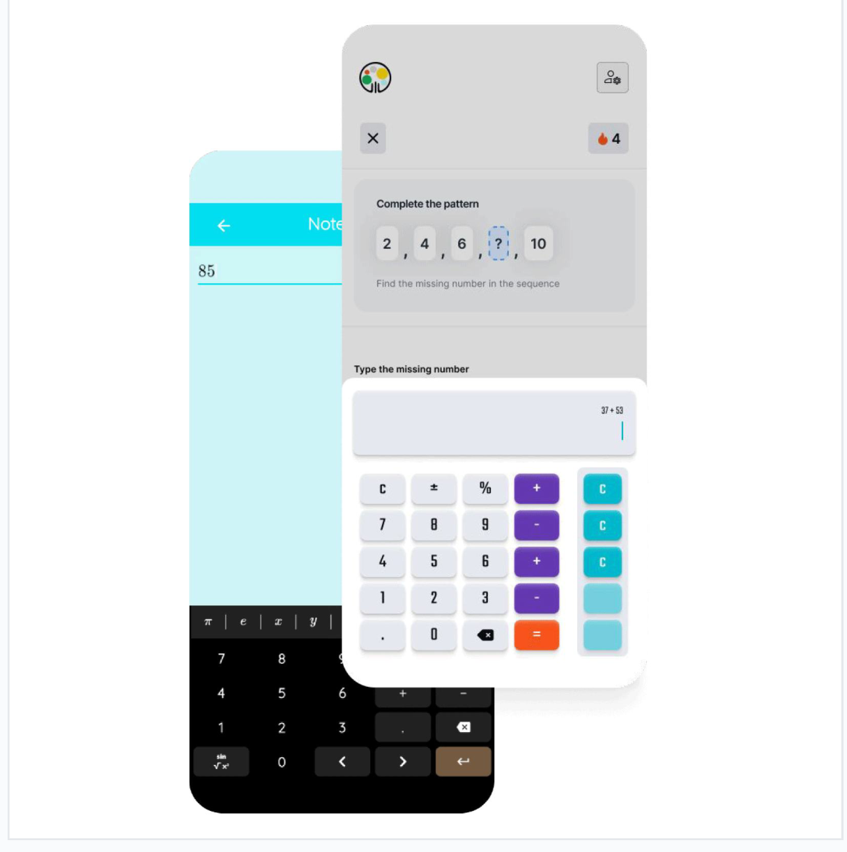
The existing calculator opened as a separate notepad, taking students away from the question they were solving. I wanted to integrate it directly into the quiz so students could calculate without losing context.
I kept the familiar four-column calculator layout so students wouldn't need to learn a new interaction pattern.
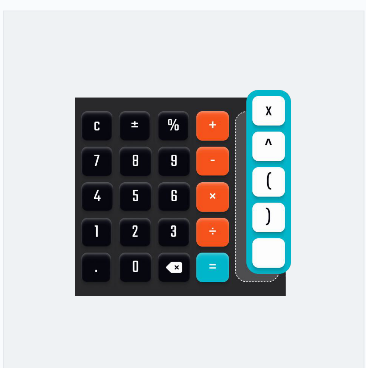
I kept the familiar four-column layout and added a fifth column for operations specific to the current question. After confirming with the developer that these controls could change dynamically, I incorporated them into the design.
The client was concerned that question-specific operations might make the quiz too easy. Rather than removing them, we tested the idea with students. The feedback supported keeping the feature, so it remained in the design.
Further Calculator Testing
The platform was tested with a Year 8 class, with student feedback relayed to me through the client. Several issues emerged in real classroom use:
There was no way to transfer from calculator to input field.
The calculator and keypad competed for space.
The calculator could sometimes obscure the question.
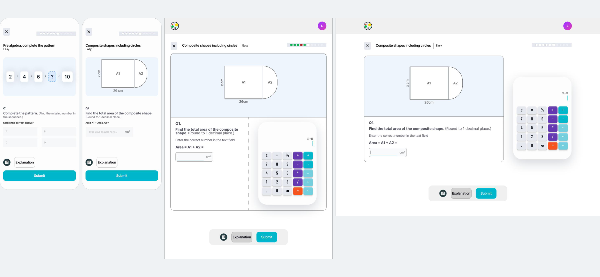
I redesigned the desktop quiz into three columns, keeping the equation consistently visible alongside the question, answer input and calculator. On mobile, the calculator is replaced by the number pad.
Setback
The product was originally being developed as a native app, but school cybersecurity restrictions created a major barrier to classroom deployment.
The team pivoted to a web app, removing the installation barrier and making the platform easier for schools to access.
For me, the pivot exposed a bigger issue: I had been improving individual screens without first understanding the product as a whole. I changed my approach, using OOUX to identify structural problems before redesigning further.
Core Flows
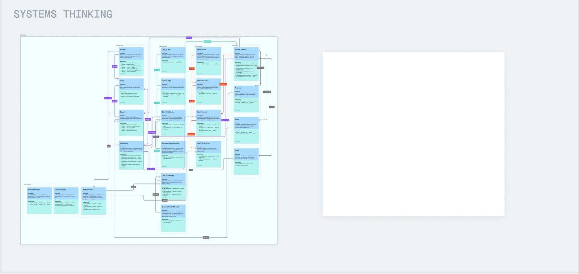
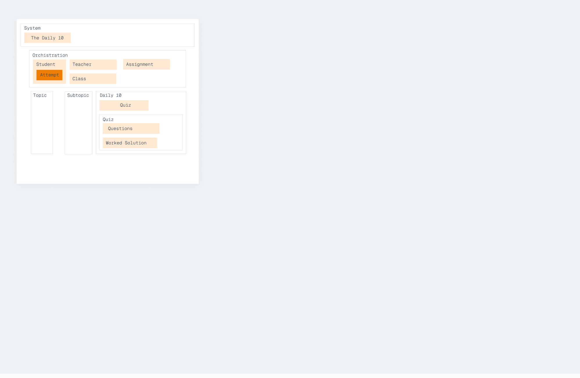
I mapped the product's core objects, their relationships and the actions users could take between them.
Information Architecture
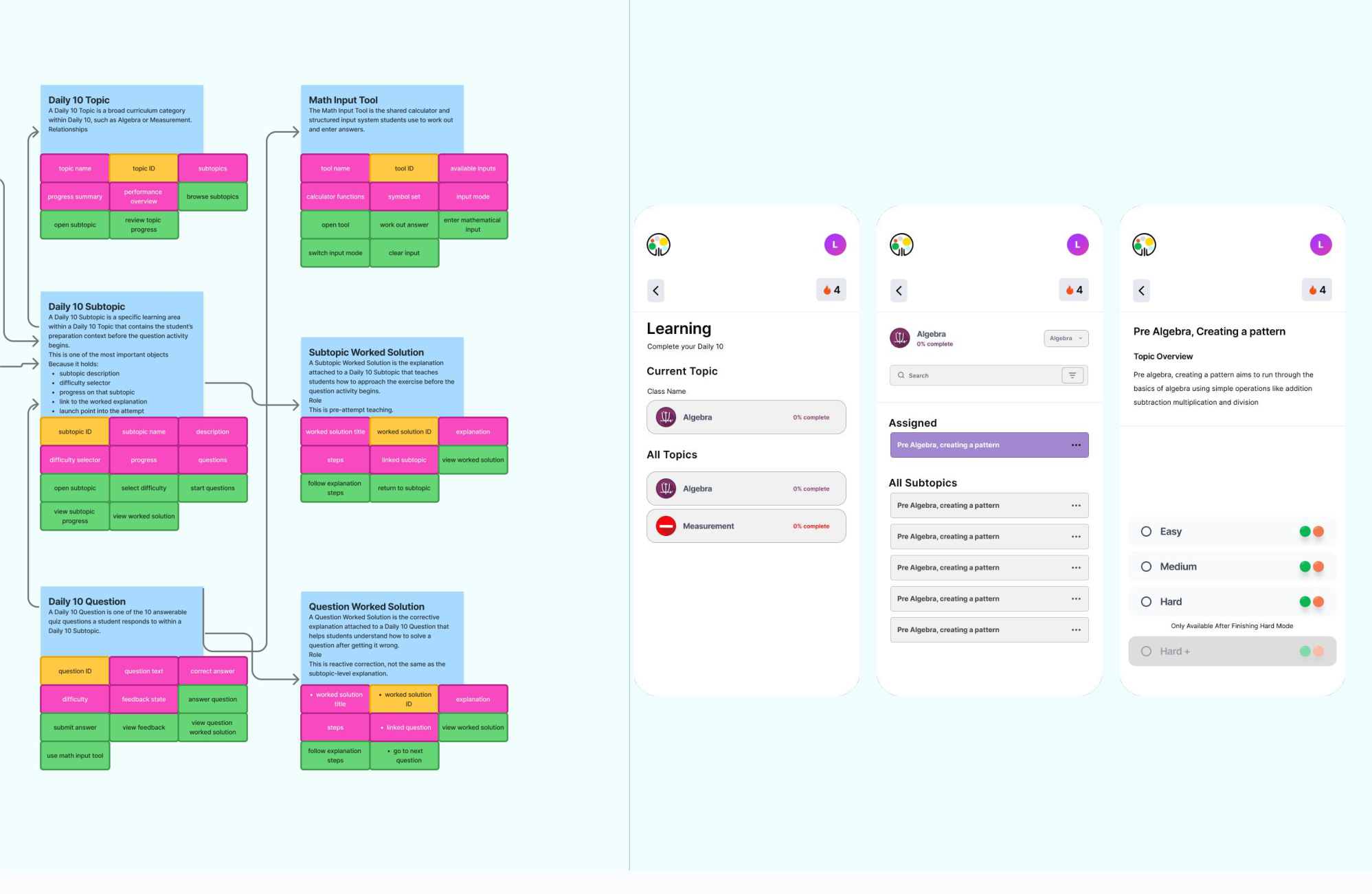
To reduce cognitive load we grouped subtopics under topics, and added a visual of what medal can be achieved for each level, which wasn't apparent before.
Improving Engagement
The original home screen was little more than three navigation buttons. It gave users no indication of what was due, what needed attention, or what their class was currently working on.
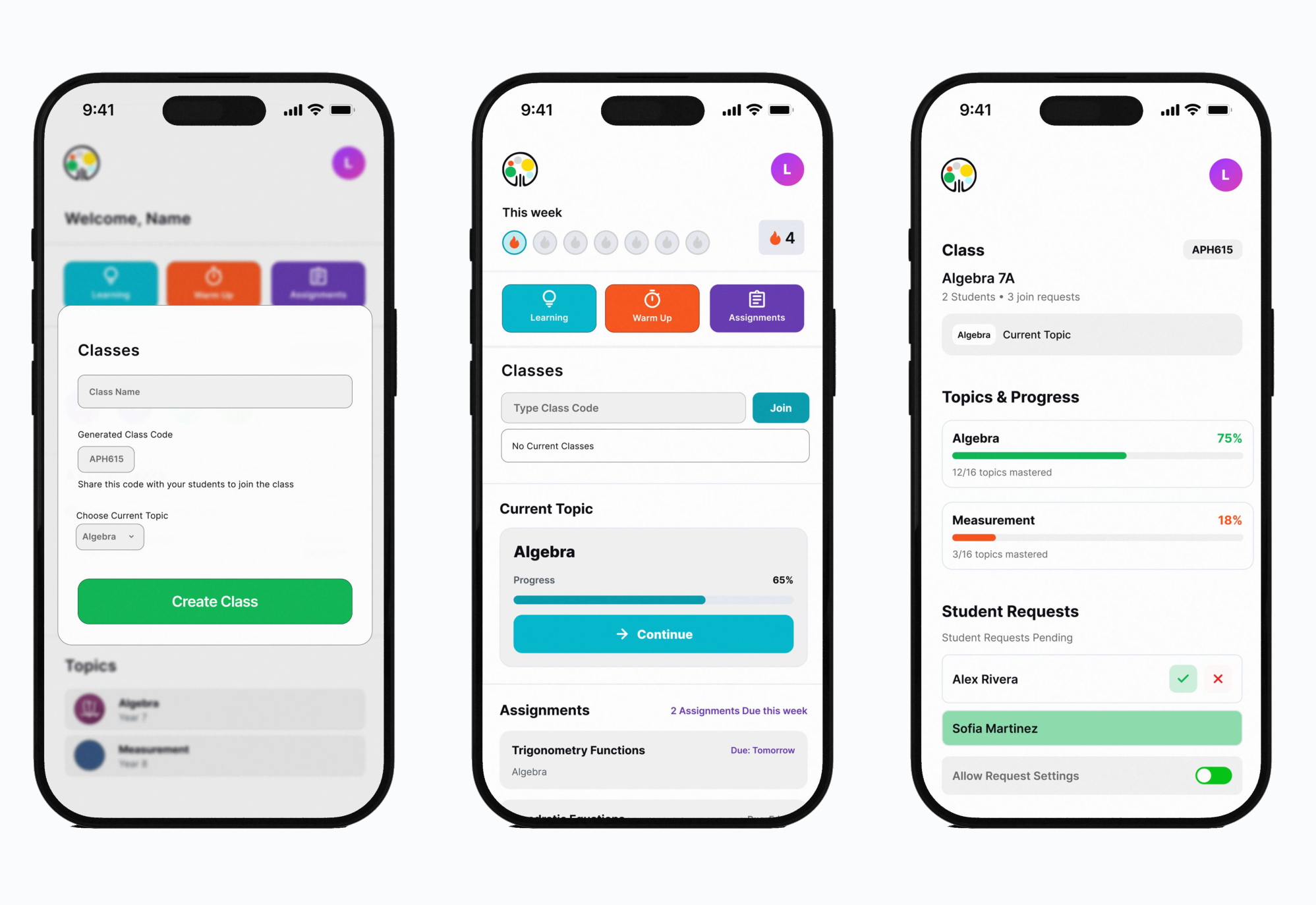
I redesigned it as a dashboard, surfacing classes, upcoming assignments and the current topic so users could understand what mattered as soon as they logged in.
What The Map Exposed
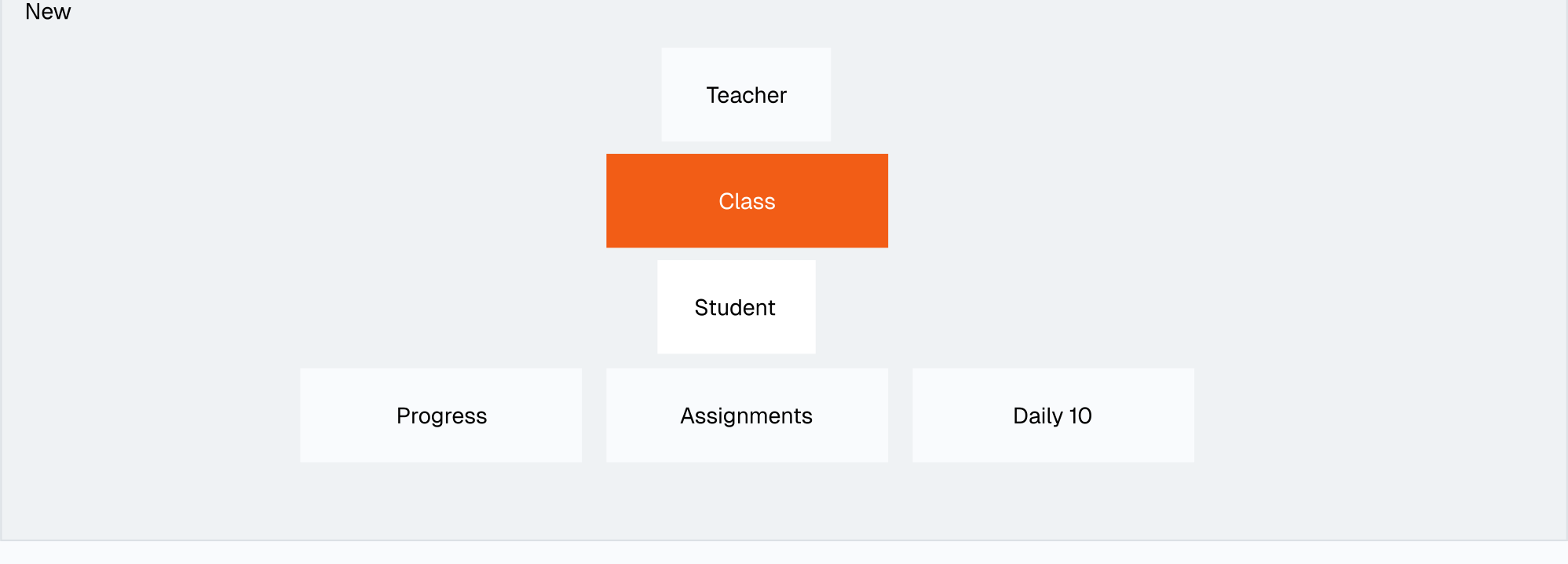
Mapping the system showed that students were being managed individually, while the real-world experience was organised around classes. Making Class a core object gave us a structure for class-level information and actions.
Strategic Directions
The teacher would create a class with a code linked to that class.
The students would enter that code in order to join, waiting on approval from the teacher.
Once accepted the student is now part of the class.
User 1: Teacher
How's my class going
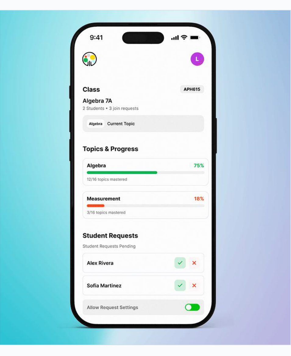
Teachers want to look at how their class is doing, see who needs help and who's completing the work.
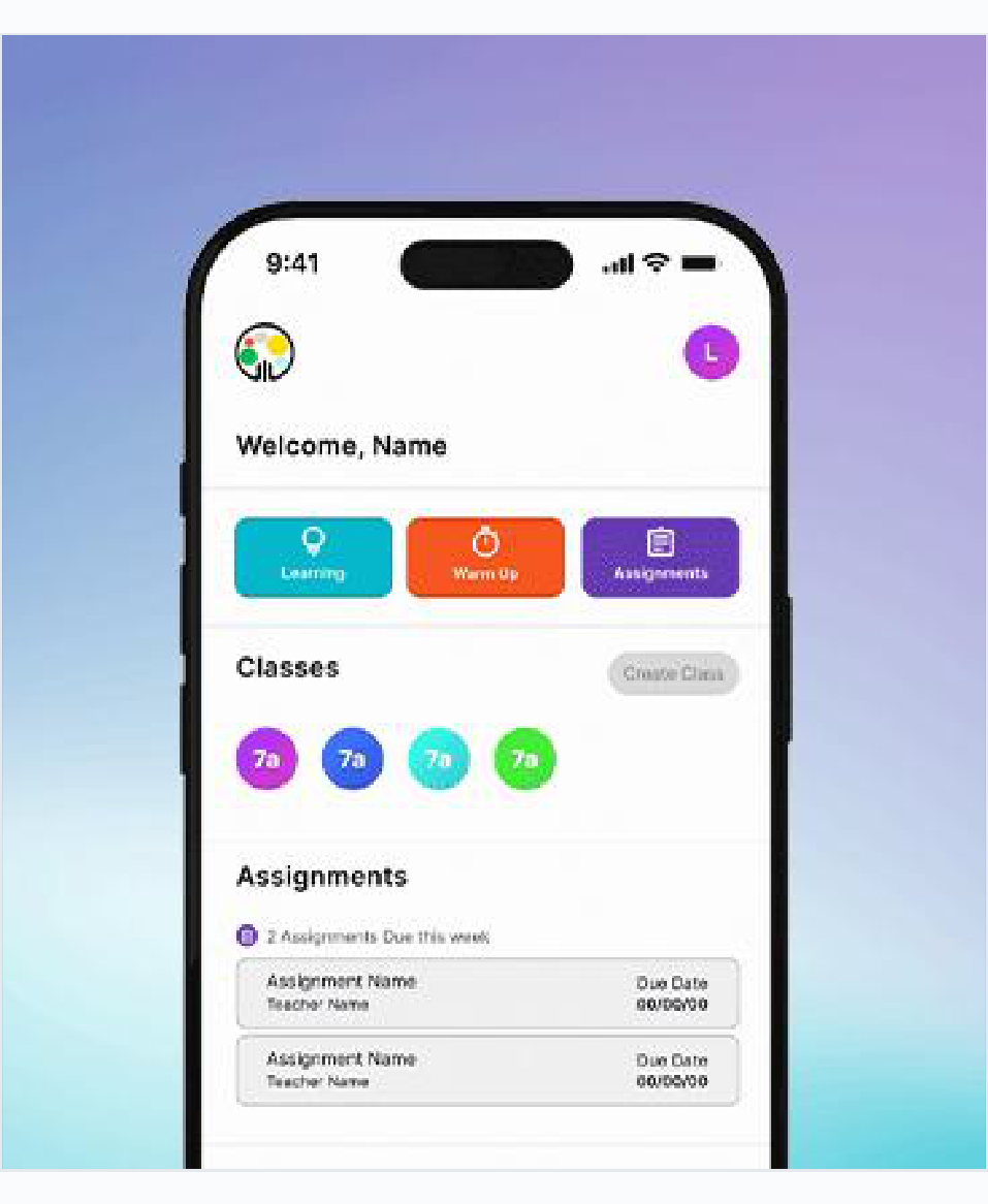
Managing Classes
Teachers need to be able to manage their classes, approve and deny requests.
User 2: Student
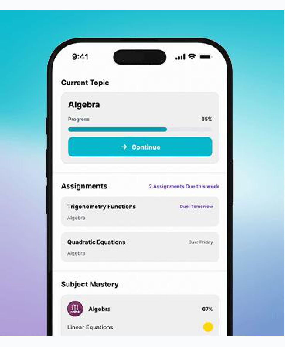
What To Do
We want to give users relevant prompts with context, to help them learn maths better and meet teachers' requirements.
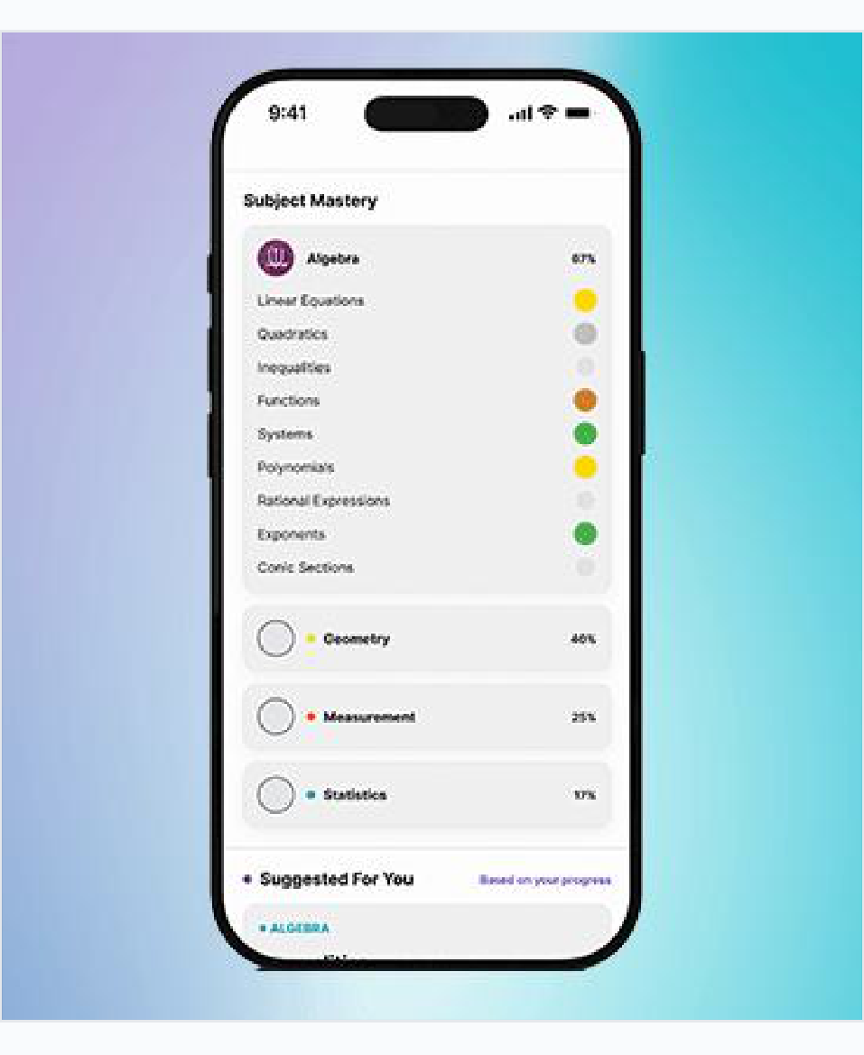
Personal Progress
Students should be able to see how they're going with their studies and where they are excelling / struggling.
Prototyping and Testing
Assignments were originally buried inside Learning Paths, meaning teachers could only create them through an existing path. Teacher feedback showed they needed the flexibility to assign work independently.
Despite the technical challenge of refactoring the existing system, we separated Assignments into a standalone feature. Teachers could now create work from scratch or enter from a Learning Path or Class, with relevant information pre-filled.
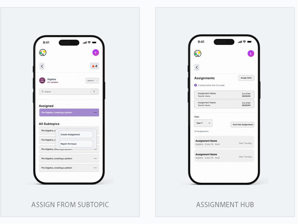
Using real-life context to enhance existing features in the app.
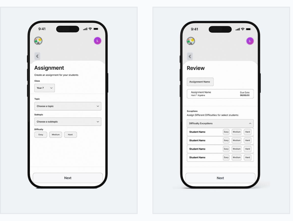
Exploring interfaces focused on real-time assistance.
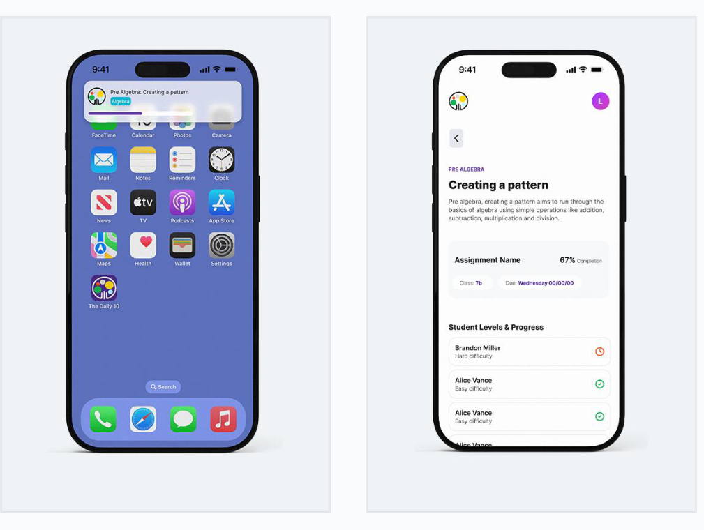
Notification, dashboard visibility, incomplete students prioritised first.
Designing For Hardware Constraints
Whilst working on it the students' syllabus had changed from algebra to measurement, which was an important detail.
We had to ask:
How do we incorporate the syllabus without restricting other areas?
Constraining The Experience
The class set up allowed us to give teachers the freedom to select what the current topic is for students, which could then highlight this for students as teachers as the area of focus.
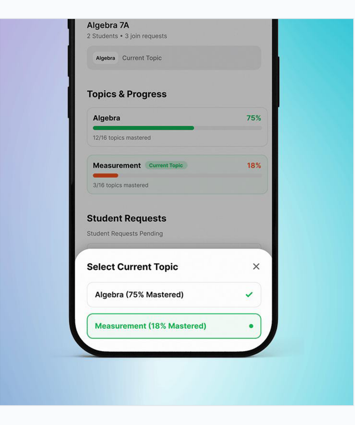
Teachers can set the current topic on the class, highlighting it across student and teacher views as the shared area of focus.
Early on, questions were written first and I designed around them. As the product grew, it became clear that content, design and development needed a shared structure.
I worked with the team to create a question framework that aligned the learning goal, difficulty progression, interface and feedback before a question was built.
Each section has 10 questions
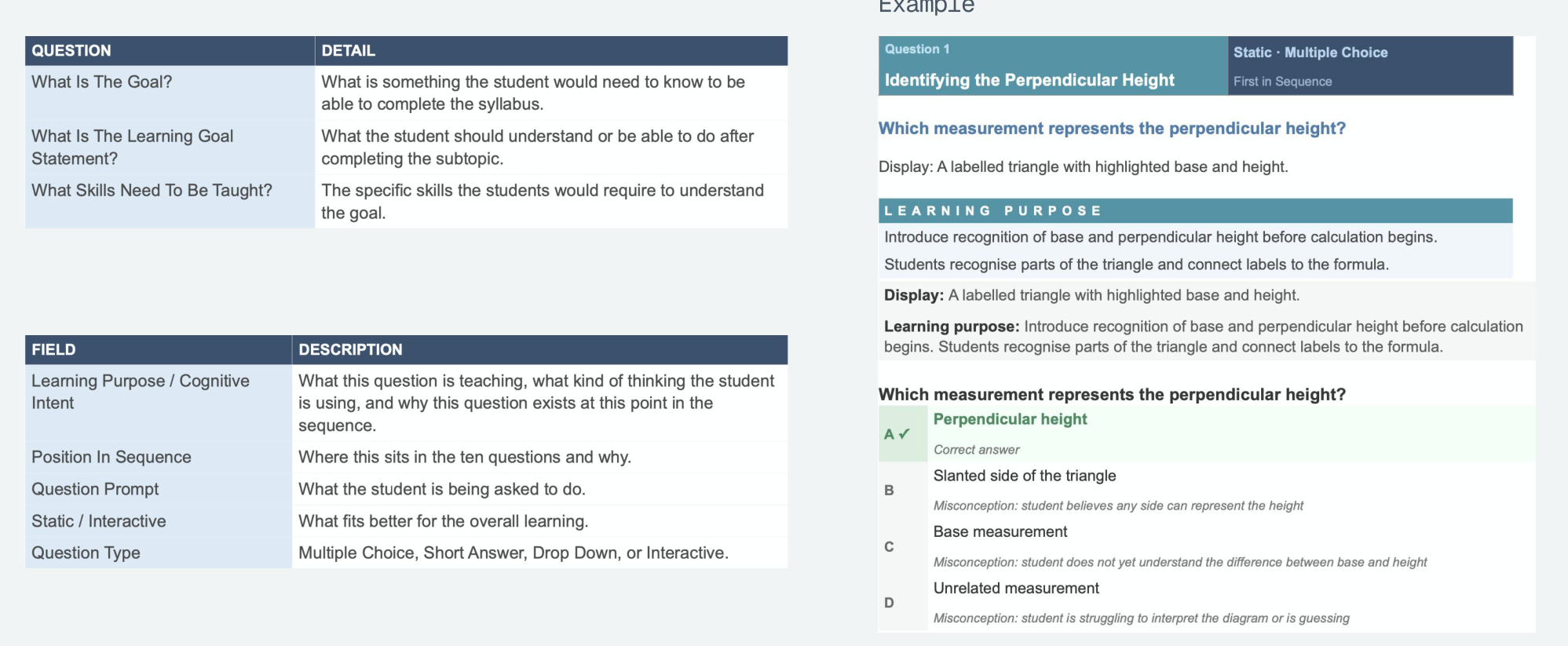
Getting an answer wrong shouldn't end the learning process. I designed the feedback flow to respond to the mistake and give students another opportunity to apply what they'd learned.
01 — First attempt incorrect
Students receive a worked solution based on the specific misconception behind their answer, rather than generic feedback.
02 — Try the concept again
Students receive the same concept with different numbers, giving them another opportunity to apply what they just learned.
03 — Still incorrect
After a second incorrect attempt, the student continues rather than becoming stuck in the same question.
Reflection
Object Oriented Design which helps manage complex systems, find the important questions early and is a great resource in working with AI.
It's not just about designing an amazing feature, but how it fits into the existing system, and how it fits into users' mental models.
More Work